Build your own Custom Toast Message in React Native
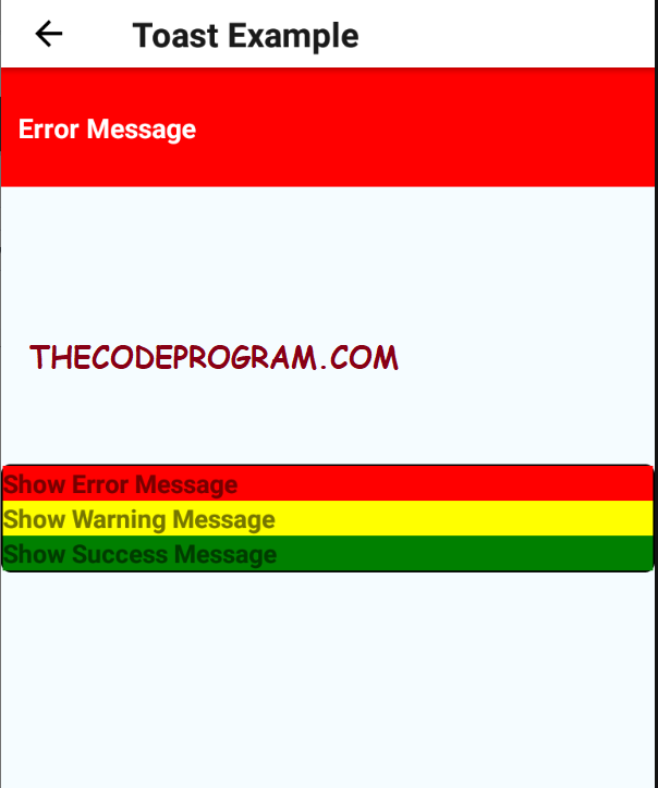
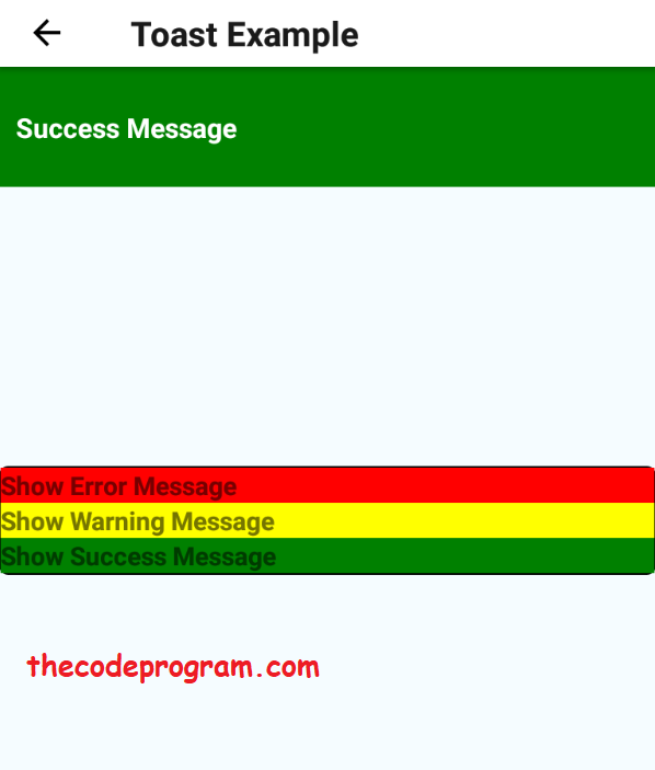
Hello everyone, in this article we are going to talk about How to create own Custom Toast Message with React native. You know the Toast message is a dialog type that shows a message and disappear after it in android. We will make it in React native without any plugin.Let's begin.
First we are going to use Animated, View and Text components in the React Native. So first add below lines top of the code:
import React, { Component } from 'react';
import {
  AppRegistry,
  Platform,
  StyleSheet,
  Text,
  View,
  Animated
} from 'react-native';
Our libraries are ready now. So we need to create our class and render function. In this function we are going to create the toast dialog and locate it under render function. Below you will see the related design codes.
In here we created an Animated View. We will specify the animated views color and the text which is inside of thes animated view. When we clicked the animation button it will show the animated dialog and show the custom message within it.
export default class NewContent extends Component<{}> {

    constructor(props) {
        super(props);

        message: 'Success!',
        toastColor: 'green',
        modalShown: false,

    };

 render() {

    let animation = this.animatedValue.interpolate({
       inputRange: [0, .3, 1],
       outputRange: [-70, -10, 0]
     })
    return (
      <View style={styles.container}>
           <Animated.View
                  style={{
                        transform: [{ translateY: animation }],
                        height: 70,
                        backgroundColor: this.state.toastColor,
                        position: 'absolute',
                        justifyContent:  'center',
                        zIndex:10000 }}>
              <Text style={{ color: 'white',  fontSize:16, fontWeight: 'bold' }}>
                { this.state.message }
              </Text>
            </Animated.View>
       </View>
    )
}
Now we have create our methods to show and hide the custom message dialog. First we will set the color and message according to notification type. If we set the type as error, color will be red, if the type is success the color will be green and else if the type is warning color will be yellow.
Below code block will make this preparation for this:
  setToastType(message='Success!', type='success') {
    let color
    if (type == 'error') color = 'red'
    if (type == 'warning') color = '#ec971f'
    if (type == 'success') color = 'green'
    this.setState({ toastColor: color, message: message })
  }
With above method we are going to set the type with the message. If the show variable not set we will show. We will set the state variables. First thing that we will do in below method is setting the color and the message of the Toast message. After setting the color and message we will start the animation with Animated.timing. After it it will be appeared then will disappeared after specified time.
  showToast(message, type) {
    if(this.state.modalShown) return
    this.setToastType(message, type)
    this.setState({ modalShown: true })
    Animated.timing(
      this.animatedValue,
      {
        toValue: 1,
        duration: 350
      }).start(this.closeToast())
  }
At the end of the time we will hide the message. Below code block will do it.
  closeToast() {
    setTimeout(() => {
      this.setState({ modalShown: false })
      Animated.timing(
      this.animatedValue,
      {
        toValue: 0,
        duration: 350
      }).start()
    }, 2000)
  }
Our functions are ready now. After this we are going to clikck a button and it will call our toast message.
      <TouchableHighlight
        style={{
            backgroundColor: 'red',
          }}
        onPress={() => {
          this.callToast("Error Message", 'error');
        }}  >
        <Text style={styles.modalContentStyle}>
          {"Show Error Message"}
        </Text>
   </TouchableHighlight>
You can reach the example file with : https://github.com/thecodeprogram/TheSingleFiles/blob/master/ToastExample.js
That is all in this article.
Have a good building own Toast Message.
I wish you all have healthy days.
Burak Hamdi TUFAN.


Comments